
We, humans, are visual creatures. We evolved reasonable abstraction capabilities but we shine when we can visualize the problem at hand.
This is why I’m a big fan of Data Visualization as a discipline. Data has the answers. Visualization helps us better understand and interpret them.
(For a great introduction to the subject, consider taking the Data Visualization course by my colleague Alex Aklson, Ph.D.)
Perhaps, above all, I like the exploratory nature of visualizing data. We must be mindful of clustering illusions and type I errors, but it’s fun to explore unbridled, feeding our intuition and the part of our brain that seeks patterns.
Let’s consider an example. Take a look at this list of numbers.
[21, 71, 41, 35, 41, 83, 48, 62, 26, 40, 46, 90, 50, 23, 11, 86, 95, 4, 50, 25, 93, 19, 67, 10, 27, 38, 78, 6, 71, 15, 11, 13, 10, 89, 3, 52, 98, 65, 97, 17, 64, 25, 33, 78, 28, 25, 85, 68, 2, 72, 63, 50, 9, 2, 52, 61, 62, 73, 89, 77, 10, 95, 5, 85, 46, 89, 70, 47, 20, 51, 6, 4, 51, 44, 79, 24, 63, 55, 99, 92, 29, 63, 16, 78, 15, 6, 91, 85, 8, 71, 23, 63, 67, 28, 44, 86, 83, 98, 57, 91]
Notice anything interesting?
If you look at it hard enough, chances are your brain will come up with something. Don’t feel bad if it didn’t as this is just a list of 100 random numbers (technically, pseudo-random numbers).
If we chart these points, we get a representation of this randomness.

There is no pattern to be had. Charting these scattered points is not entirely useless, however.
Knowing full well that my brain will try to find a pattern, I let it play and noticed something. Nothing too surprising, but some dots appear to line up. This can easily be seen above y = 40, for example.
Well, big deal, some numbers are randomly repeated. Yes, but… now, I’m curious. How often are numbers repeated?
Let’s chart once more, this time using the frequency of occurrence on the y-axis.

This looks a little less random, doesn’t it? With this set of 100 draws, the range appears to be between 0 (the number wasn’t drawn) and 4 repetitions (in the case of number 63).
(This conjured some unrelated thoughts about the survivorship bias. I humorously imagined the top dots on the chart selling books to the lower dots about how to succeed. But I digress.)
It’s also visually obvious that there are fewer and fewer numbers as the frequency of repetition goes up. This makes sense. The odds of a number being present at least once are fairly high:
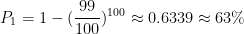
While the odds of it being repeated 100 times are virtually zero:
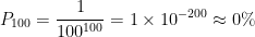
Every other frequency falls in between these two bounds.
Okay, cool, with 100 draws we seem to have quite a few numbers repeating 3 times, with one number even repeating 4 times.
A hypothesis emerges
We can hypothesize that as the number of draws increases, we might see a larger number of maximum repetitions as well. With 100, we comfortably hit 3 repetitions with several numbers, and we even had a 4. What happens with 1000, 10,000, 100,000 draws?
It feels like the odds of a number appearing even more frequently by chance should go up.
In other words, the maximum number of repetitions, as a function of the number of draws, should diverge. Very slowly, mind you, but it should diverge.
Hmm, slowly diverge. Logarithmically, perhaps? Just a hunch, but let’s throw caution to the wind, and hazard an even stronger hypothesis.
With n=100, observation leads us to a fairly safe guess. Namely, it’s very likely that at least one number will repeat at least 3 times. 3, in our case, happens to be 
I bet the odds aren’t too bad for 
So our guess/hypothesis becomes:
Given n integers randomly selected from 1 to n, there is a high probability that at least one number will be repeated at least log n + 1 times.
This would imply:
| n | Repetitions |
| 1000 | 4 |
| 10,000 | 5 |
| 100,000 | 6 |
Let’s fire up good ol’ Python and see where we land.
When I ran the code (shown at the end) for n = 1000 I got the following chart.

Look at all those points on y = 4. Even 
Let’s try n = 10,000.

Yup. We expected some numbers to be repeated 5 times, and we got quite a few of those.
Okay, time to bring out the big guns. n=100,000.

It looks like it still holds. There is a multitude of numbers with 6 repetitions.
So what
OK, so we started off with random data and through visualization and a bit of intuition, we came up with a pretty neat (if conservative) rule about how often numbers repeat by chance. Along with some room to refine our guess and experiment further.
This is the essence of science. You observe phenomena, formulate a hypothesis, and then try to prove or disprove it through experimentation.
Now, before the rigorous mathematicians among my readers have a conniption, all this doesn’t prove the hypothesis above. Of course.
What does highly likely even mean in this context? Is it 90%, or 99.999% How does it vary as n varies? You’ll want to analytically verify this and calculate what the actual odds for the occurrence of at least
I have not had the time to take this further step (the solution is likely not as trivial as it first looks). At the risk of enraging you with a flashback from your college days, I’m afraid I’ll have to leave this as an exercise for the reader. 😉
But this fun exploration is what got us to the hypothesis and these follow up questions in the first place. Historically, people have often figured out some mathematical relation or hint of it before they could rigorously prove it or had the exact answer.
The Babylonians come to mind, as they might have figured out the Pythagorean Theorem before they had a rigorous proof:
The famous and controversial Plimpton 322 clay tablet, believed to date from around 1800 BCE, suggests that the Babylonians may well have known the secret of right-angled triangles (that the square of the hypotenuse equals the sum of the square of the other two sides) many centuries before the Greek Pythagoras. The tablet appears to list 15 perfect Pythagorean triangles with whole number sides, although some claim that they were merely academic exercises, and not deliberate manifestations of Pythagorean triples.
— Luke Mastin
Computer simulation and data visualization have just opened us up to a world of mathematical exploration not previously accessible to any human.
Plotting in Python with Matplotlib
If all the math above isn’t very interesting to you, the Python 3 code I used to plot the charts may be of greater interest.
This is the code in its entirety.
import matplotlib.pyplot as plt
import random

MAX_NUM = 1000

x_values = range(1, MAX_NUM + 1)
values = [random.randint(1, MAX_NUM) for x in x_values]
y_values = [values.count(x) for x in x_values]

plt.style.use("seaborn")
fig, ax = plt.subplots()
ax.scatter(x_values, y_values, s=10)

ax.set_title(f"Random Number Occurrences (N = {MAX_NUM})", fontsize=18)
ax.set_xlabel("Number", fontsize=14)
ax.set_ylabel("Occurrences", fontsize=14)

ax.tick_params(axis="both", which="major", labelsize=14)

plt.show()
Let’s break it down. We start off by importing pyplot from matplotlib and random since we’ll be generating pseudo-random numbers.
In truth, we could use secrets for better randomness, but it’s overkill here and the results are unaffected.
import matplotlib.pyplot as plt
import random
We then set our input size (MAX_NUM), generate that number of random values (values) and aggregate their frequency in y_values.
MAX_NUM = 1000

x_values = range(1, MAX_NUM + 1)
values = [random.randint(1, MAX_NUM) for x in x_values]
y_values = [values.count(x) for x in x_values]
Here we set some styling for the chart so that it looks a bit better. We pick the seaborn style, set the thickness of the dots (10 made them fairly visible), and set the labels for the axes.
plt.style.use("seaborn")
fig, ax = plt.subplots()
ax.scatter(x_values, y_values, s=10)

ax.set_title(f"Random Number Occurrences (N = {MAX_NUM})", fontsize=18)
ax.set_xlabel("Number", fontsize=14)
ax.set_ylabel("Occurrences", fontsize=14)

ax.tick_params(axis="both", which="major", labelsize=14)
Finally, we show the graph.
plt.show()Let me know if you enjoy this type of exploration and I might create a few more posts like this. Or conversely, feel free to tell me why I’m wrong about everything, in the comments below. 🙂
Special thanks to John McGowan of Mathematical Sofware. I’m immensely grateful for his comments on an earlier draft of the article, although any errors remain my own.
Get more stuff like this
Subscribe to my mailing list to receive similar updates about programming.
Thank you for subscribing. Please check your email to confirm your subscription.
Something went wrong.
You inspired me to go play with some datasets from Kaggle and play with it. Great article.
Thank you, A. M. That’s all I really hoped to accomplish with this article.
Having just started “Python Basics for Data Science”, I was looking for a ‘real world’ example that I could use to show friends that playing with data can be fun… and here it is. Thank you!
Awesome. Thanks for stopping by and commenting, Tim.